Monday, March 31, 2008

A little bit of matter, and a little bit more

Thursday : P.S.1. Whack-Feminist art movement


I was going to sum it up in one sentence for thursdays art exhibition. But, maybe I'll elaborate on why I absolutely hated it. Let's be sure to start off on the right foot. This movement back in the 60's and 70's was radical. It was something that took the nation by storm; this was something that took the female population by surprise.

The thing i don't understand is, why did it have to be so bold? I mean, yeah this was a response to a suppressive opponent, but really? How does exposing yourself provocatively say anything except destroy the beauty of the female body. In my opinion it does. Let's look at Hilary Clinton. She's running for President of the United States, and she is doing it with her clothes on. Thats bold and thats radical in itself. It's not like females are addicted to exposing themselves, showing their sexual side and provocatively inducing themselves to sexual acts at every moment they have just to support an emergent movement. They're females, not beasts. At least they should be. That's just gross. And maybe I don't get it. so I'll say it. I just don't get it.

Ok, so it's art. It's speaking revelations. That's fine. But honestly what isn't art? Couldn't they have gotten their message across with less graphic of images? I guess I understand that it wanted to be something that no one had ever seen before. This movement wanted to shock its viewers and let them know that they were serious. But if you think about, it's not like we haven't seen a nude female before. I just didn't appreciate the way these women presented themselves in each of these photographs. I felt like the way these women were represented diminished the beauty of the female body. I like to put women on a pedestal; hold them as a foreign object; like a rare breed that's hard to lure. It's romantic, it keeps the game interesting. it keeps a driving passion. Maybe thats my closet romantic side talking. It's also interesting to note that this is probably what they wanted. They know that the female body is beautiful so they're agreeing to disagree with everyone, and show them that they are more than just an object of beauty. But of voice, power and attitude. I think this art still has relevance today because this art form still has not become a norm in todays society, and will always be knocking at societies door until it gets let it. And that may never happen, so thus Whack! exists and will probably continue to exist in future societies. Once this art form is a norm, well, the end of the world is probably near. I just thought this style of pronunciation was overbearing and in your face sexual. I apparently was unaware that we communicated with our genitalia. I like the idea behind it, way behind it. It's powerful. Im just still 13 and can't appreciate this style of art.


Sculpture Center


Each installation within the sculpture center had to do with the idea of what is Modern. Let along, what makes it modern? The idea is that once an object is taken out of its natural environment how can it function as it is supposed to since its design is manufactured for specificity. Or is it? Once an object is taken out of its environment does it still function the same way? does it still serve its design purpose? And is it still modern? Then what is modern, and what makes it modern?

One of Tim Burrs installations that really got me was this one.

He used redish stage lights that transcended upon the wooden stage of this piece while a black american flag hung over pipes that encased the red, wooden floor. i found this incredibly intriguing; it plays with the idea of stage and theater: the act of depicting a story. The black american flag appears to be drained of its color which has now been bleed onto the floor. While the floor and whole piece is encased by prison like bars; perhaps indicating limited freedom. Again, the poles also seem to add a stage like attitude. There are many theatrical elements taken out of their habitat, and now serve as an installation in the sculpture center. So is it modern art? Are they still functioning? This is the question. In my mind they are. So does that make it modern? Technically. In my opinion. There is also a knocked over chair representing something of a struggle or opposition. Its quite the political piece. Tim Burr Incorporates many objects that have been taken out of their natural environments, he includes many theatrical elements incorporated into a space that blend as one to narrate a story. He seems to maintain the idea the life is a script. Wow, that's deep.

Friday, March 28, 2008

Take me to the riot


The MOMA

On wednesday we traveled to the Museum of Modern Art and the Whitney Bienniel. The MOMA was just what we needed. It was filled with pieces of all colors and shapes. Just for the record, I'm not a Matisse fan. I just don't understand his work. It's flat and boring. I don't get it, and to be honest, I don't care enough to get it. Modern art is incredibly interesting. It's colorful and possessive. It can attract you just as easily as it can repel you. The MOMA contained a plethora of pieces, so many peices im not even sure where to begin, except for maybe the greatest piece there. which would be this guy.


I was lucky enough to spot him up in the corner of one of the taller galleries. I couldn't stop grinning.

Color is just as important as the object being displayed. IF NOT MORE IMPORTANT. Seriously. Color is huge. I am addicted to neon colors. They drag me in with no escape. If pieces did not contain colors that attracted me, I would have nothing to do with art. I would probably be failing nursing school right about now, or snowshoeing in Alaska with no potential future ahead of me, or maybe even 200 pounds heavier with a chronic indigestion problem. Thank you neon colors for saving my life. I love Rauchenbergs pieces that were in the Moma. However, convienently, I decided to delete them to make more room on my camera, for other photos that im not even going to talk about. So, I'll use another another Rauschenberg piece for example.

He silks screens JFK as well as others in other works. But it's interesting to note the color. The vibrancy and alertness they bring to the forefront. Its JFK. He was important.

Andy Warhol was the master at life. His piece caught me, as well as many other pieces of his work does. I.Love.This.Piece. Its jeenyus. Purely. It's a two canvas spread where only one canvas has multiple prints on it, while the other has nothing but background color. The layout of this piece screamed brilliancy. Its classic, clear and simple; it's straight to the point. It has apparently found and moved the cheese. Color is life. If this piece did not incorporate these two colors, I would have walked right past it only waving to Andy instead of striking up a conversation.


these were some others that made it onto my camera.


AFTER THE MOMA WHEN WENT TO THE WHITNEY BIENNIEL.

This was a waste of time. No wonder its a bienniel. It should really be a neverenniel.

There were however a few pieces that were kinda cool. But most of the stuff, I just didn't get. I don't understand what the curator was thinking. Other than the fact that he or she should consider a different profession. Cuz' man, what a stupid show. Nothing seemed to make any sense. Yeah, things looked cool, and maybe sounded cool. But it was random at best. It was the equivalent of walking around a zoo with no animals in sight. You start to wonder what your doing there. And then you realize that dollar fifty hot dog you ate just outside the Whitney never tasted better. I gave Whitney an F. You can take that either of the two ways.

Thursday, March 27, 2008

Something bigger, something brighter

On Tuesday we walked around the Chelsea district which was a really cool experience. We went to a bunch of different galleries in the Chelsea district, and saw some pretty amazing artwork by an abundance of awesome artists. I wanted to die by the end of the day. My mind was fried and I had lost both my legs back on 26th ave. But it was well worth it.

A cool installation worth viewing. This was a bunch of little ropes sprung all over.


First off, there was the DIVA NY 2008 "The Streets" happening. Which, was about 9 different shipping crates located on the sides of the streets scattered between 20th and 26th. They blended in well with all of the construction going on in this part of town. Overall, I really wasent impressed with these installations of Digital Art. I was really excited to go and see these, but it turns out they were very forgettable. However, there was one piece that stood out by Ethan Cohen (Brother of Joel Cohen who both recently directed No Country For Old Men.) He directed an interesting piece that was told from three perspectives while each perspective was told on a different TV screen. Each screen was next to each other, so you got to see the main story but different views to this story, which was a bit confusing at first, but later turned amazing. It was really dark for pictures, so none turned out very well. But imagine going into a huge storage crate, that could be mistaken for a garbage receptacle, and finding thousands of dollars worth of electronic equipment inside. That was a sight within itself.

Another Crate contained the work of Ray Bartkus. He appears to do most of his work in Photoshop. His crate maintained a bunch of politically influenced photoshoped images spanning from Bill Clinton to the war in Iraq. This piece focused on specifically news anchors going crazy.


Another artists work who we saw was the work of Jordan Eagle. He uses cow's blood. Its seriously maybe the coolest thing I have ever seen. He uses plexiglass, resin and cow's blood to create some pretty intense artwork. it's almost disgusting, but he makes 10 grand a piece, and every show he goes to, he sells out. So, he lives a pretty incredible life. Its really interesting how he incorporates a natural substance; a necessity in life, something that is associated with pain, death and violence, and turns it into something epic looking. Like warp speed. only red.


In the David Zwirner Gallery, we saw the work of Marcel Dzama whos work was creepy and...just creepy. I feel like weird circus music should have been playing in the background.

One of his pieces reflects his attitude toward Duchamps piece, "Étont donnés." Where a nude can be eerily seen, like the viewer is peeping through a crack in the door. This was Duchamps last piece and very little is known about it. besides the fact its undeniably creepy. What we see is a nude female sprawled out on twigs somewhere in the country side. She also happens to be holding an oil lamp.

Dzama's piece is an imitation, but with a more of a sarcastic overtone. In his piece the viewer is able to see a male and a female lying next to each other against the same setting, except there appears to be a fox behind the two bodies. Perhaps indicating what killed these two. There is even a slingshot in this piece possibly indicating the weapon that killed them. This comical representation of Duchamps piece, obviously represents it and definitely lessens the mysteriousness about it. Hes allowing us top conclude that a fox killed two lovers with a slingshot. While Duchamps piece clearly does not allow as much interpretation. I feel like Dzama is poking fun at the melodramatic attitude in Duchamps piece.


We also saw Brian Jungens work of woven sports jerseys. This is the artist who makes african masks out of nike running shoes. Hes pretty weird. And weird people are interesting. So, it all works out well. After seeing one, you've seen them all. Trust me, i got bored after the first one.

They're kinda Native American lookin' also very leathery. Thats pretty much it. However they served an interesting proposition of melding sports teams in harmony. They were the equivalent to a gigantic peace sign. And that is why I don't like them. They are implying peace between sports teams. Rivals. Yeah, right. Are you kidding me? There would be no such thing as sports without rivalries, and teams who absolutely wanted to destroy another. It just doesn't happen. You can't have peace, you can't meld teams together in the sports industry. Games would not be intense. Fans and money would not exist. You have to have competition. These jersey's are like a dichotomy. And a bad one at that. Brian Jungen, your getting me riled up. I don't like your artwork. I like competition and ferocity. It's nice. So don't mess with it, because that's all America has goin' for itself right now.

Wednesday, March 26, 2008

This is your brain on conceptual art. tra lautpecnoc no niarb ruoy si sihT


DIA : BEACON

On Monday, we traveled an hour and a half to the Dia Beacon. A wear-house turned awesome museum. Especially since our French tour guide would refrain from telling us certain things. He was awesome. Straight up. He would usually end his sentences with, "blah, blah, blah...and that's all I'm going to say about that." Interesting fella. He was also French.

This place was amazing. Very modern. And very white. Not in a racial sense, but as in the walls.

First off, this is our conceptual piece created by Me, Kira and Malina. The Dia beacon was really good, we weren't making fun of it. But we may have been mocking the idea more than anything, even though we really enjoyed it. its like making fun of something ridiculous... ridiculously cool, because its so absurd. also, i think kira was poking fun at my shirt color.


The first piece that I found awesome was Gerhad Ricters installation Six Grey Mirrors. These mirrors reflected everything. They made me think they were ginourmous Ikea mega-speakers, and I just wanted to sit and listen. These mirrors had more transparency; it was like looking through a car window, only not being able to see the inside of the car. No element had priority over the other. This installation incorporated everything and allowed the audience to participate in the piece. Thus, played with the idea of live art, and always incorporating constant fluidity within the piece. It was like a constance of inconstant imagery.


Another piece that took me was Louis Bourgeois's Crouching Spider. It was made out of Bronze, or something closely related, and took up most of the room that it was installed in. This thing was epic. Clearly. Areas on the spider were tarnished so it made it look like the spiders muscles were bulging out of its skin. Totally disgusting. But totally awesome. It was graphic, and I was waiting for it to come alive and eat me. What is interesting is that her design of the spider was that the spider was composed of cylindrical tubing's. If you know her work, you'll know that she is into creating phallic objects. So, blah blah blah, thats all I'm going to say about that. I hate spiders.

Dying never felt so cool


Cai Guo-Qiang

"I want to believe"

Guggenheim

Walking into the Guggenheim for the first time, I couldn't get over the fact that I had 7 compact Chevrolet sedans suspended over my head. I questioned safety for about a half a second, then was overcome by what a sight this truly was. Cai Guo-Qiang surely sees death and beauty through violence. In my personal opinion, I find it incredibly intriguing that people can be attracted to this idea because of the impact of reality actually becoming real. People like destruction. As long as it has nothing to do with them. Its the act of overpowering, taking pleasure in knowing that one has the power in totally annihilating something. It's fun. Try it. People are intrigued by death because death is unknown. And obviously people can be revolted by the idea of destruction because death is death and there isn't much you can do about it. Your dead, get over it. Its the idea of not being able to have the power to control your life. The beauty in destruction is the idea of creation.

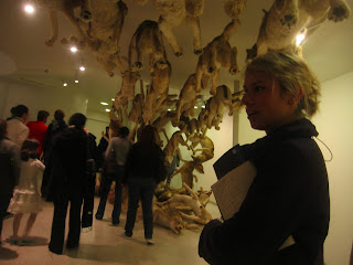
His piece about the berlin wall was a rather interesting one. He used wolves. Lots of em'. They were running in pack and eventually lifting off the ground higher and higher until eventually they hit a clear wall and fell into a pile. Great meaning and representation of invisible freedom.


I also liked Guo-Qiang's ability to spend loads of money on art. Part of me could only see dollar bills suspended in air. I felt like his art wasn't what I was looking at, but rather his work in getting the money to pollute the Guggenheim with Disneyland for artists. Thats cool, if your into that. I mean, don't get me wrong, it was entertaining. Just like a mainstream movie. And most of his work had some pretty cool in depth meaning behind it. It's just, thats all it was. A bunch of big things for people to oogle and boogle about. Wow. Amazing. Maybe thats too much of an elitist standpoint. Like designing your own clothes verses buying them at old navy. I'm more of a walrus than an elitist. I also ride a fixed gear.

Sunday, March 23, 2008

Jasper might destroy you

Jasper Johns : Grey
periscope


Interesting, rather. 

Much of his work was in fact grey. Yes, it's true. but was it necessary? I mean, grey is a nice filler and all, but Jasper, buddy...really? Grey?All of it? ...Alright. 
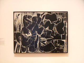
I'm not even going to lie, it's a great idea. And thats pretty much 99% of this business. It proves art still exists. Good art in fact. But some of his work just reminded me too much of my red-eye i.e. worst flight ever from PDX. However, his work "Periscope" was amazing. Blew my mind completely. Much of the font would spell out colors in different sized stencil font. Simple and brilliant. It was a dried up smear of rivers of Nestles Chocolate Syrup on a large canvas that was set out in the sun for too long and crispified into a coalescent beauty. It's look and form radiated with modern elements that were just knocking the other paintings off the walls. Elements of abstraction, and disjunction; separated into thirds. However the uniformity of this piece is disrupted by a half circle that impedes the continuity of Jaspers incrediabstractedness. Periscope played well with the negative space which surrounded it because of its ambiguous color simplicity. Grey. Well done Jasper. There really isn't a need for any other color, grey just punishes.
His other pieces, which were basically synonyms of each other, were Jubilee (1959) and his color version False start (1959).

false start

Jubilee
 
False start was vibrant. It was colorful, and boisterous. This piece utilized multiple, striking blotches of color. Randomly, these blotches of paint almost seemed to represent a checkers board, only a fruity checkers board. In front of these blotches of paint were stenciled words naming colors. However, when it said BLUE, the color of that font was not blue, it was red. This remained the theme through out the painting for all his text. This piece was created in 1959. let's not forget that. This was truly a modern piece then, if not still now. This piece is epic. Stencil font is a popular and widely abused font in todays design world. Especially among urban artists, along with skateboarding and snowboard designers. Three or four years ago, an atomic bomb went off in the urban fashion world and the word cliché became known. Fast. For Johns to use this idea back in the late 50's is very interesting. Honestly, what was he thinking? This piece was way beyond its time. I feel like maybe thats why this piece was auctioned for 17 million. Probably a little more ridiculous than incredible, but nonetheless incredible. The simplicity of this piece is beautiful. It really is. It's colors brushed in randomness with stencil words that lie to you is bold, and it works. I just can't get over the fact that it can still be considered modern. This just proving that waves of styles get recycled by hipster doofuses who cash in on good ideas turned bad art.